Sales by Hour Heat Map

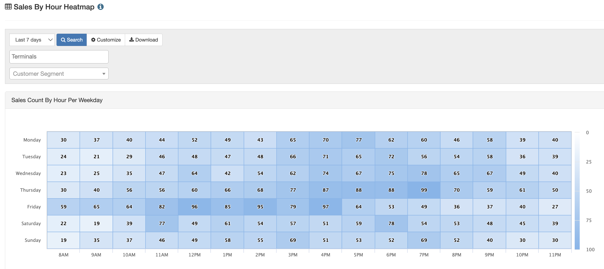
The sales by hour heat map provides a visual representation of sales by hour for each day of the week. The chart is great for helping identify peak sale hours by day of week when considering staffing and making tough scheduling calls.
This report is a great way to identify when your venue is expected to be the busiest. Using color to visually represent the amount of sales per hour, you can easily see what times your venue had the most and least amount of sales. Additionally, hovering over certain time slots reveals specific metrics about that time, such as sales data, discount data, refund data, and net sales.
Customize the Report:
To customize the report even further, click the Customize button next to the search bar. This will take you to the custom sales report with the hour as the pre-selected group. Learn more about custom reporting HERE.
Download the Report:
To download the full report that breaks down each specific day by hour, click the Download button located at the top of the page.
For additional assistance, please reach out to POSaBIT support @ 1 (855) POSaBIT OR SUPPORT@POSaBIT.COM